How to Make Your Website Look More Professional?

If you’re doing business online, you will definitely need a website.
No matter if you pay a team of designers or decide to use a free website maker tool, there are a few important aspects to keep in mind. And maybe the most important of the bunch is how professional your website looks.
If you think about it, it makes perfect sense.
Which website would you rather trust?
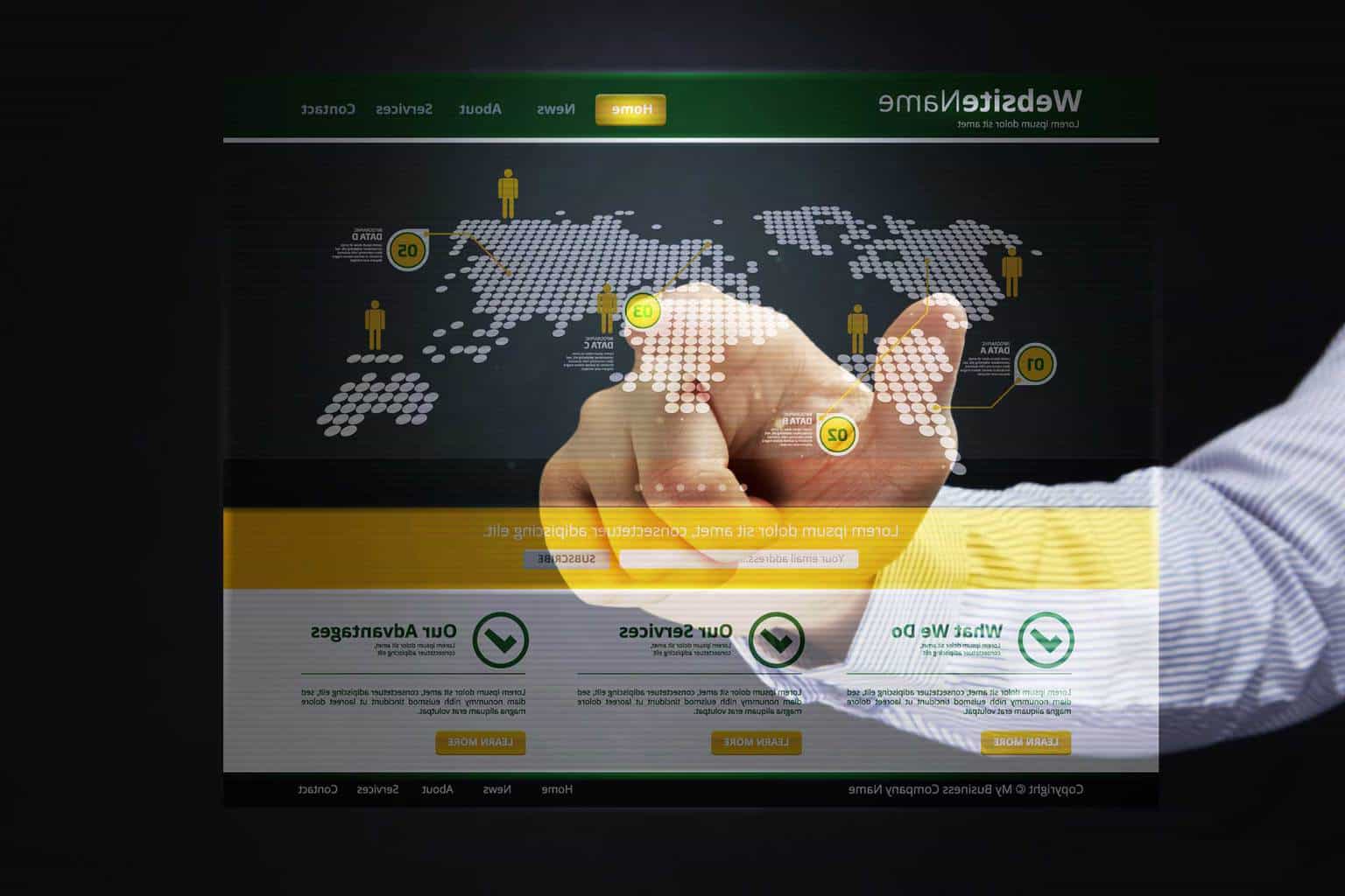
One that’s stuck in the early 2000s, with pixelated graphics and WordArt font?
Or one that uses crisp modern design and smooth transitions to keep you engaged?
The answer is obvious. So if you want to make your website stand out from the crowd and drive more sales, keep on reading to find out how to make it look more professional.
Invest in a Domain Name

This is something you should think about even before building your website. What’s it going to be called? What domain name are you going to use? When you register a domain for your website, you tell the world that your business is legit and build trust with a potential customer.
Before you do that, make sure to do a domain name search and make sure the one you want to buy is still available. And if you’re lucky enough to find it, waste no time and buy it. Thousands of domain names are registered every day so waiting to buy yours could possibly lead to disappointment. That’s if someone registered it before you did, of course.
Keep the Images Professional

The first impression is the most important one. Once a prospect has made a first opinion about your website, it will be hard to change that. So make sure you give people a great first impression by using the right pictures. A picture is worth a thousand words and it has the potential to instantly catch the eye of a client and make them want to find out more.
The best pictures are obviously the ones taken by a professional and tailored to your website’s needs. But obviously, not everyone can afford that. There are a few free stock photo options out there – you just have to do a bit of research.
Use Good Fonts
Fonts play a huge part in how your website looks. They can change the overall look and feel of your website so we recommend you pay close attention to what fonts you use. Always choose fonts that match the personality and tone of voice of your brand. For example, if you own a law firm, we recommend you use more conventional fonts that will communicate professionalism.

After you’ve chosen the right fonts, it’s also important you know how to use them. The headings, titles and subheadings should always be bigger fonts. Just make sure the rest of the text is easily readable and easy on the eyes.
Upload a Favicon
Favicons are those little icons that show up right beside your website’s name in the browser. This helps build a better brand image and show the people that you’re serious about your website.
Every website maker has an option that will allow you to easily add a favicon to your website. It only takes a few minutes of your time, but it makes a huge difference in the way your site looks to visitors.
Keep It Simple

A professional website doesn’t have to be full of flashy icons and animations. Quite the contrary – less is more. Try to avoid the visual clutter as much as possible. Use simple graphics, simple fonts and simple colors that are easy on the eyes and don’t put strain on your visitors’ attention.
Minimalism is becoming more and more popular and for good reason. So you should keep that in mind when it comes to your website. Give your page some room to breathe and if you must add flashy images or animations, make sure to leave plenty of white space to balance it out.
One of the most important goals of your website should be a good user experience. Your website should always be designed in a manner that makes it easy to access and navigate through. Truth is, your visitors don’t have much time to spend on your website and if you waste it with useless information and cluttered menus, you will definitely lose them.

When all the elements of your website are well organized, your visitors will want to spend more time there. This usually means an increase in leads and even conversions. You see, it really doesn’t matter how state-of-the-art beautiful your website is – if it’s hard to navigate, people will leave. It’s as simple as that.
Mind the Icons
As small as they might be, icons are a very important part when it comes to the overall look and feel of your website. They offer better visual comprehension to a client, even before they get to read the text. However, don’t just go around adding random icons to your website – they should also fit your brand’s image and voice.
So, for example, if you have rounded buttons and shapes all over your website, don’t use square icons. They also have to look the same – if you want to add some Twitter, Facebook or LinkedIn icons, they’ll have to come in the same colors, thickness and opacity.
Our Conclusion
A professional-looking website is the most important tool when attracting new customers. Just make sure you offer them an easy to navigate experience that’s not straining on the eyes and brain.
When building your very own website, just keep in mind that less is more. And if you do decide to add that “more”, just make sure you balance it out with some white space to allow your viewers a much-needed respite.
There are really no downsides of having a professional-looking website. You’ll be bringing in more leads, generating more conversions and building a solid reputation for your brand!


