10 Awesome Responsive Web Design Inspirations You Need to See
In this time when devices come in all shapes and sizes, there’s a dire need to have your website adapt and present itself in the best manner possible. One of the best ways to achieve this is through a responsive web design where the site and all its elements automatically adjust to the screen size, resulting in an excellent site across devices.
If you are looking at building your site, or if you are planning to rework your site to follow the responsive web design, take these sites who are winning in the responsive web design concept as inspiration:
The Cool Club
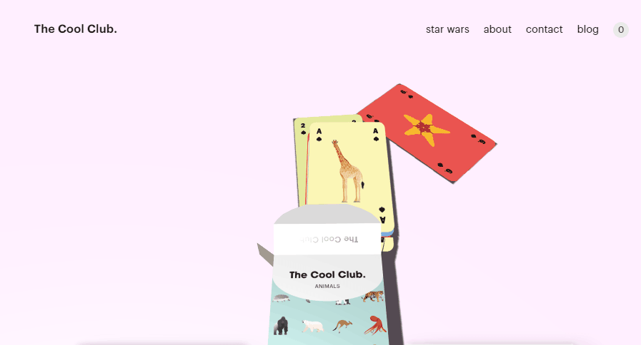
The Cool Club is a site owned by artists from The Netherlands who offer exciting card games and posters. Their website features their product offerings in a simple and organized manner that maximizes white space to focus the viewers’ attention on the products.
Numerous micro-interactions also make the site very interesting. Even the initial loading of the site is very appealing. The site further utilizes a responsive web design, and the product gallery will seamlessly adapt to the screen size, ensuring that the products are seen at their best at all times. The navigation bar that is visible at full screen also turns into a hamburger menu when the screen width is limited.
Waaark
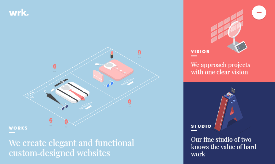
Waaark offers custom-design websites, and their capability statement is their site itself. It features a highly-animated yet very fluid web design. The site also seamlessly makes use of responsive web design, so the site looks excellent from different devices, retaining its organized looks.
At full size, the whole homepage fits on the screen. It transitions into a long form when the screen gets smaller. Also, at full size, the case studies in the works page scrolls over in an animated fashion instead of being presented all together vertically in a smaller screen.
More Hazards
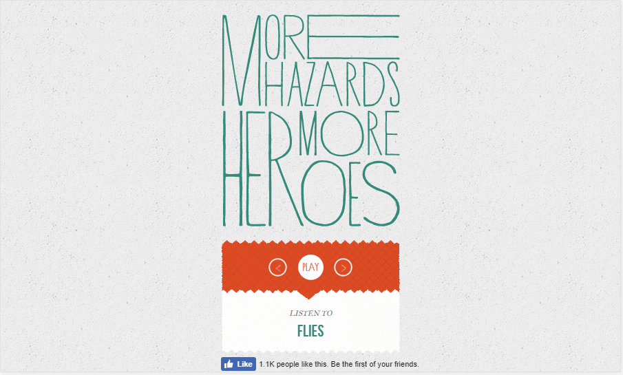
A site owned by the More Hazards More Heroes duo from Nashville who takes inspiration from the Kings of Convenience’s Quiet is the New Loud, morehazards.com presents a collection of songs from their album and plays them on site. The site centers on a vinyl record that animates when you play the song.
At full size, the viewer would be able to see all 12 songs from the album, but on a smaller screen, the site would be left with the vinyl record and simple control to play the songs, serving the site’s purpose.
Mugs
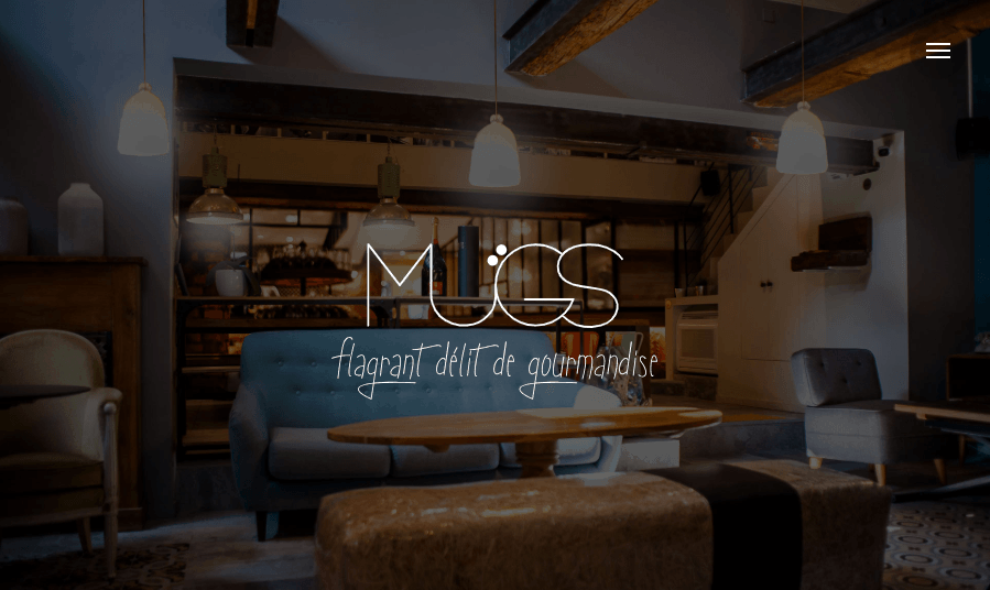
Mugs is a modern French canteen with an equally cool site. The site does not hold back on all the visual elements, as well as animations, but the site remains very fluid. The full experience is also retained regardless of where you access the site from because it perfectly adjusts to your screen size.
Michael Villar
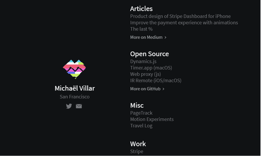
Michaelvillar.com focuses on minimalism riddled with a few exciting animations. It’s a simple site that leads followers to his works on other sites. The site also correctly taps the responsive web design that delivers the same feel across varying screens.
MRY
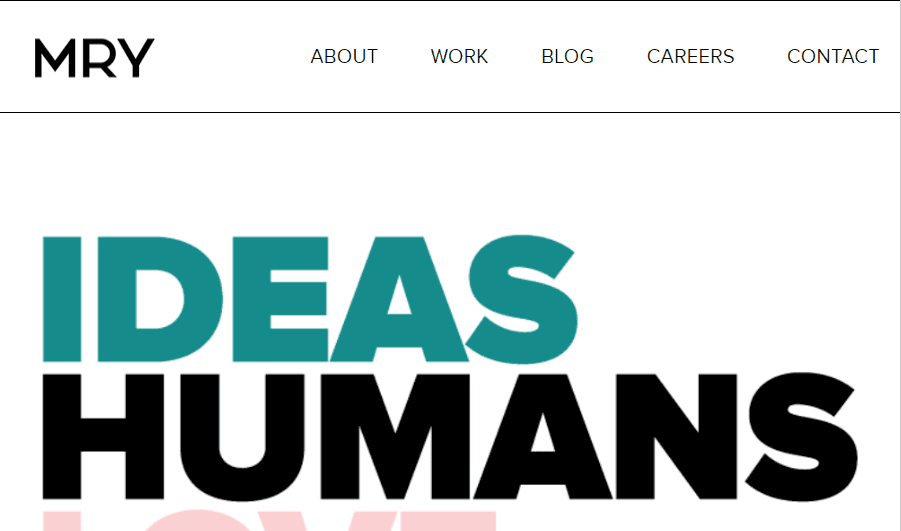
MRY is a creative agency that has helped brands such as Google, Walmart, Vans, and Adobe. The team features channel-proof campaigns, coming up with solutions that take no particular medium above others.
Meanwhile, the site features bold texts and banner photos that perfectly adjusts to the size of the screen, maintaining the same level of experience regardless of which device the site is accessed from.
Beam

Another great site is Beam, a design and digital marketing agency based in Boston. The site’s home page will take you through 4 case studies that scroll over each other, before taking you to the team’s services and additional information.
The site makes proper use of a responsive web design where items lined horizontally will automatically adjust and present align themselves vertically into a long form to retain readability even when the screen size is reduced.
HubSpot

Hubspot offers a great software that can effectively help in marketing and sales. The site highlights the tool’s features, as well as critical statistics. Full size on a desktop, the site will horizontally present these items, maximizing the screen width. It seamlessly transitions to a long form when the need arises, showing the proper use of responsive web design.
Bonobos
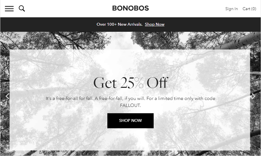
Bonobos is an online men’s fashion store. As an e-commerce store with numerous product lines, navigation is vital. At full screen, a menu bar can be seen. But, as the screen gets smaller, the navigation bar transforms into a simple hamburger menu to still retain mobility within the site.
Furthermore, the site also transitions into a long form as needed, correctly adjusting to the screen size of the device where the site is being viewed.
World Wildlife Fund
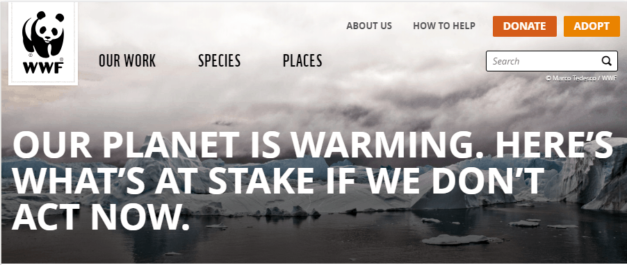
Finally, there’s the World Wildlife Fund. The site is very organized and carries a pretty professional look. At full size, the site also has a navigation bar to take you to different pages in the site, which then transforms into a hamburger menu as the digital real estate gets smaller.
Meanwhile, its two call-to-action buttons (donate and adopt) are retained regardless of screen size. This is done to highlight the site’s primary purpose irrespective of how one is viewing the site.
Ready to take your site to the next level?
Site design is a very complex concept. It takes into consideration numerous elements, and there is no one way to determine what makes a good design for all sites. It all boils down to crafting a site that serves its purpose, matching it with visual appeal, and commendable performance to be a genuinely delightful website that can earn its followers. And of course, there’s a need to ensure inclusivity because such followers will come from anywhere, and they would be using different kinds of devices to get a hold of your site so make sure you utilize a responsive web design. So take inspiration from these ten websites and take your site to the next level.
About the Author
Kenneth Sytian is the CEO of Sytian Productions, one of the leading web design outsourcing company in the Philippines. He has been designing websites and developing web apps for more than a decade. He is considered as one of the top influencers in web design and development.


