Web Design – Tips to Make a Great First Impression
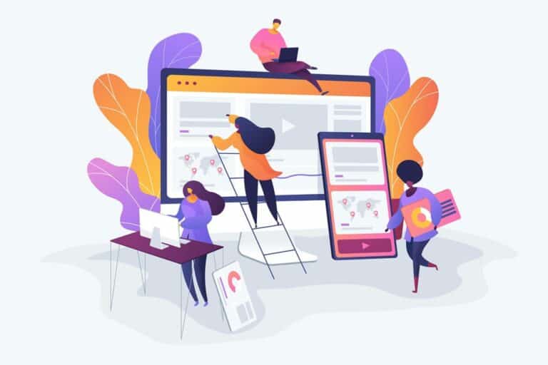
Although on your website there might be no direct face-to-face communication, the way you present yourself or your business to the world through your website or blog matters.
On the Internet, the average level of attention is very, very low. Distractions are the order of the day and it is increasingly easy for a user to leave any site they visit, in the first few seconds.
With excellent web design, the possibilities of a better connection with each person who visits our blog increase. Visitors will be more likely to read the content, subscribe, leave comments, recommend the page in social networks and of course, buy what is offered.
Web design – tips to leave an excellent first impression
Here are some of the best tips to improve your web design, offer a great first impression, and meet the goals you have with your website or blog.
Define objective # 1 of your site
Before focusing on your web design, it is very important to define your main objective. All the design elements should then help and support so that the objective can be fulfilled.
Examples of objectives:
That users subscribe to a mailing list
That they buy a product
Read the articles on a blog
Fill out a contact form to be able to offer services
Use a template or quality theme
There are thousands of templates of different styles that can be used. Some focus on a certain type of site. For example, you can find themes for blogs, for corporate sites, for freelancers, for virtual stores, etc.
The most important thing is to choose a theme or template that suits what you need and that also offers security, a great design and quality support.
High-quality images
The images are the first thing that attracts the attention of visitors to a website. That’s why you must be sure to use quality images, with good resolution, that are attractive to readers.
The objective is that the images help the reader to better consume the written content or even enrich their learning with a more visual medium.
Suitable backgrounds and textures
web-backgrounds
You may have excellent images and first level content, however, if the site contains backgrounds with very bright or very dark colours, users may prefer to leave the site immediately.
The textures you use also help you to create a better user experience and first impression. Use modern textures and backgrounds with appropriate colours.
Depending on your design, you may apply different backgrounds and textures for some areas, for example, the blog section and the entries may have a different background to the menus, headings or widgets.
Many times, in an attempt to create a great design with many functions and features you can forget the most important thing: to offer a simple, understandable navigation that facilitates the desired objective.
Experts in web design in Oxford explain that some of the most important navigation tips are:
Do not use too many widgets on sidebars that may distract the reader
Do not fill the site with advertising (unless it is a site 100% dedicated to that!)
Use colours and combinations of elements that facilitate reading (For example, same colour in titles of entries, widgets, and menus).
Do not abuse personalised menus
Maintain a minimalist style
Web design is constantly developing and evolving, so even once your site has been designed, you need to evaluate its performance regularly to make sure it is still achieving your intended objective.


