CRO Mistakes that Can Devastate Your Online Sales

Are your digital marketing efforts yielding you a pittance in conversions?
If your answer is yes, then it’s high time that you go over your conversion rate optimization (CRO) strategies one more time.
If you’ve been in the conversion game long enough, chances are you already know that there are many variables at play in driving organic traffic to your WordPress site.
They’re too many, in fact, that it’s very tempting to gloss over some of them.
The problem? One little mistake can cost you a ton of website traffic.
You see, in order for your WordPress site to reel in a ton of revenue, you need to cover all the bases.
To ensure that you haven’t missed a spot, we’ll be going over the most notable CRO mistakes that can spell doom to your bottom line.
Ready? Please read on!
1. Not Appealing to Your Customers’ Emotions
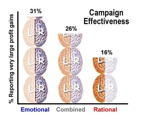
Here’s the deal with successful marketing: if you pepper your target audience with nothing but facts, you’ll be hard-pressed to convince them to buy what you have to offer.
You know why? Because you fail to engage them at an emotional level.
You’re probably saying, “but facts matter!”
Yeah, sure, but you have to keep in mind that humans, no matter how rational and logical they think they are, are naturally inclined to respond to emotional stimuli.
That doesn’t mean we’re unthinking creatures. Our emotions run deep, driving our behavior and actions in ways we can barely predict or understand.
What this means is that in every proposition we make to our target audience, it should be done in a manner that engages their emotions. To put a finer point on it, we have to address an emotional need.
There are many marketing strategies you can employ to engage a customer’s emotion, but you’ll never go wrong with the following:
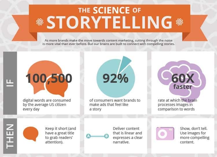
Protip #1: Use the power of storytelling
Powerful brand storytelling can influence a customer’s purchasing behavior in the same way that great works of fiction inspire people and reinforce societal positive changes.
A good story can bring down your defenses — engaging the subconscious or the so-called “reptilian brain.” Many psychologists will tell you how powerful the subconscious mind is in influencing human behavior.
Protip #2: Use the Psychology of Colors
Multiple studies show that colors have a profound impact on our purchasing behavior. It is for this very reason why large brands such as McDonald’s and Best Buy have been using the Psychology of Color as applied to marketing and branding to their advantage.
Wondering what colors you should use in your CRO efforts? This infographic from The Logo Company should be of great help:

Protip #3: Create a brand personality
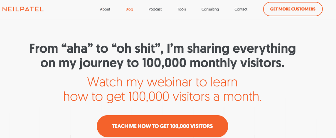
If you want your marketing efforts to elicit an emotional response from potential buyers, you need to create a brand personality whose values, goals, and beliefs align with theirs. This brand personality must then be instilled into every form of presence you have online — from your blog posts to your web copy.
It doesn’t take much to come up with a personality that appeals to your target audience.
For example, if you’re targeting licensed educators, then perhaps a more formal tone with data-driven content will do. The marketing niche, on the other hand, is more welcoming to just about any type of personality that captures engagement.
If there’s one reason why social networks are thriving over the last decade, it’s because people can get really emotional on Facebook and Twitter.
You don’t need to be an expert to know that increased customer engagement can directly impact a business’s bottom line.
If you drive up engagement in your social media pages, you’re not only raising awareness for your brand — you’re also building your brand’s trustworthiness if you rack up positive reviews, comments, and likes. Not to mention that social engagement tactics can also strengthen your SEO.
2. Misplacing CTAs
For years, the method of placing call-to-action buttons above the fold has been widely accepted.
According to a study by Content Verve, placing CTAs below the fold yields 304 percent more conversions.
Those figures, however, are a bit misleading.
But too late — the Pandora’s box has already been opened. Since then, the “above the fold versus below the fold” argument has been a topic of debate among digital marketers.
While the topic continues to divide some marketers, looking closer at the factors that come into play in CTA performance is arguably the only surefire approach.
Here are some questions that can drive home this point:
When is it okay to place the CTA above the fold?
In some cases, it makes perfect sense to put your call-to-action above the fold, especially in the following situations:
- The page is short and doesn’t have much information.
- If the page conveys everything a visitor needs to know even at first glance.
- Your brand offers a unique selling proposition (USP).
When is it okay to place the CTA below the fold?
On the flip side, here are the circumstances where it might be best to put the CTA below the fold:
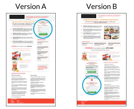
- If you’ve created copy that visitors can invest themselves in and will feel compelled to read all the way to the bottom.
- The page has directional cues or visual aids that guide visitors towards the CTA.
- When your value proposition requires more elaboration to be understood by the common visitor.
Is the fold irrelevant?
Is the fold irrelevant?
Well, yes and no.
There’s no cut-and-dried approach when it comes to the “fold.” CTA placement can be tricky.
We can be sure, however, that making the right call depends on knowing the right time when a customer will be compelled to respond to a CTA. In short, the most important thing is for your CTA to be placed below the right amount of copy.
3. Ignoring the Mobile Side of CRO
The number of mobile phone users worldwide has increased to a point where it’s simply crazy for any serious digital marketer to ignore the mobile side of CRO.
A Statista study reports that an estimated 62.9 percent of the global population will be active mobile phone users by 2019.
You’ll have to be the laziest marketer alive if you’re not motivated to get a slice of that big pie.
To do that, you need to focus on optimizing the user experience of mobile users.
In terms of content layout, what looks just right on the desktop may look irregular when loaded on a mobile device. That is because smartphones, by default, have vertical displays that have aren’t meant to display a desktop website in full width.
The best solution, of course, is to streamline your content’s layout with responsive design.
Put simply, it pertains to website elements that can adjust, reposition, and scale according to the display being used. Most website builders and content management systems have loads of ready-to-use responsive themes and templates — all you need to do is install them and maybe run your website through the Google Mobile-Friendly Test to be sure.

You can also refer to the Accelerated Mobile Pages (AMP) website, an open source initiative that aims to help developers create consistently fast and responsive mobile pages.
There is a bit of learning curve when creating AMP pages. Fortunately, everything you need to know and use is well laid-out in the official AMP documentation repository.
4. Ignoring site speed optimization
One aspect of content rate optimization you can’t afford to miss is website speed.
For starters, a site’s loading speed is an important ranking factor in search engines. It can also cut your website’s conversion potential by around half, especially on mobile.
According to Google, 53 percent of visitors will abandon a webpage that’s taking longer than 3 seconds to load. That’s over half of your prospective leads gone in literally seconds.
Now, for the solution. Here are some of the steps you can take to give your WordPress site a boost in loading speed:
Protip #1: Run your website through a speed diagnostic tool
Before doing anything else, you need to run your website through a speed test.
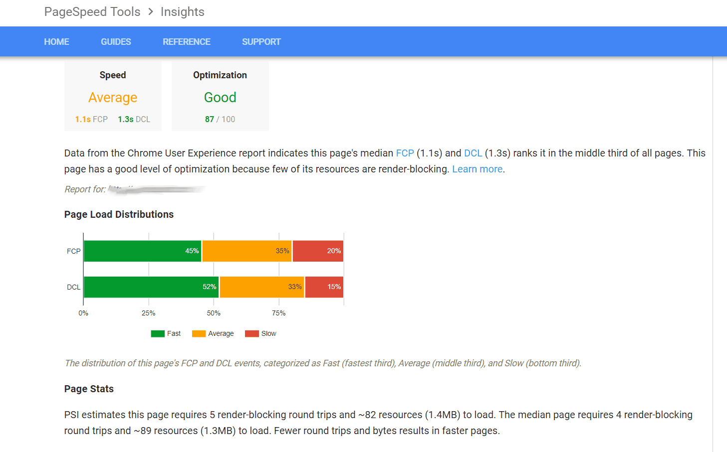
Google PageSpeed Insights is an excellent website speed diagnostic tool that does that for you and more. On top of showing relevant data explaining why your site is slow, it also provides you with specific steps on how you can improve your site’s loading speed.
Protip #2: Use a CDN (Content Delivery Network)
A content delivery network is indispensable to any speed optimization efforts because it ensures reliable website performance across the globe.
In simple terms, a CDN is a network of servers distributed across key locations around the globe — makes the delivery of static content more efficient wherever your target audience resides.
If you’re feeling stumped as to which CDNs to use, go with tried and tested company like Incapsula instead of experimenting with untested alternatives and putting your website’s performance at risk.
Protip #3: Implement website caching
Website caching describes the technology that temporarily stores HTTP responses for much faster retrieval when the same page is accessed at a later time.
Enabling web caching your website can be a complicated process. Thankfully, you don’t have to go through that ordeal by yourself.
There are free website speed optimization tools like GTMetrix and WP Super Cache that can do the dirty work for you.
Key Takeaway
CRO has evolved considerably in the past few years, and it’s getting tougher for every digital marketer to keep up with the latest updates.
If there’s one thing that remained the same, it’s the role of User Experience (UX) in driving conversion success.
Like every marketer, you’re bound to make mistakes along the way. But that’s fine.
As long as you stay focused on delivering real value to your target audience, chances are you’re still on the right track.


