
Reducing Development Time With Pre-built React UI Component Library
You ever catch yourself rebuilding the same UI bits—like buttons, modals, or tabs—over and over again?
Honestly, it’s not just boring—it burns up hours you could spend doing something more meaningful. That’s where React UI libraries come in clutch. Instead of messing with CSS for the hundredth time, you just grab a component that’s already built, drop it in, and keep going. Way less stress, way more progress.
Libraries like Radix UI and Headless UI come loaded with accessible components. You get structure, responsiveness, and exceptional accessibility support without doing extra work. It’s all baked in.
Here’s the thing: a Retool report showed 86% of respondents believe their organisation spent as much or more time on internal tools than they did the year prior. That’s wild. With the React UI component library, you cut that time dramatically.
In real-world projects—like admin dashboards or e-commerce platforms—complex components like dropdowns or sliders are a given. A good UI library lets you drop them in without hassle. No need to rebuild the wheel every time.
And these tools aren’t just fast—they’re reliable. You get clean code, fewer bugs, and easier updates. Honestly, grabbing a quality React UI library is like having a shortcut to production-ready UI.
Why waste time on the basics when someone’s already done it right?
Understanding Pre-built React UI Component Library
What they are, why they matter, and how they streamline real-world projects.
Let’s be honest—It’s not realistic to build user interface( UI) every time from scratch? It’s not realistic anymore. That’s why pre-built React UI components are a lifesaver for teams building modern web applications.
They’re reusable chunks of UI—modals, dropdowns, buttons, tabs, forms—you name it. These aren’t raw code blocks. They’re polished, ready-to-use, and packed with logic. You import them from a component library and drop them right into your project. That’s it.
Popular libraries like Material UI, Chakra UI, and Ant Design have become developer favourites. They come with pre-styled components, layout options, and custom theme support baked in. You’ll find tools for everything, including data visualisation, form handling, and layout management, with solid cross platform compatibility too.
For example, Material UI offers Google’s design system adapted for React. The result? Slick, reliable, and scalable components. Chakra UI is lighter and great if you want a clean aesthetic and an intuitive API. It’s backed by strong community support, too. Need enterprise-grade power? Ant Design and ReExt bring high-level components that scale.
Let’s say you’re building a reporting dashboard. Rather than crafting tables and charts manually, you pull them from your go-to React UI library. It saves time, reduces bugs, and you still get great results.
That kind of shortcut improves the development process, smooths out the learning curve, and lets you deliver new features faster.
At this point, using React UI libraries isn’t just smart—it’s the new standard.
Advantages of Using Pre-built React UI Components
Why do dev teams lean on libraries? It’s all about moving faster, staying consistent, and scaling without the chaos.
Honestly, front-end work can feel like rinse and repeat. Buttons, forms, modals—it’s the same drill. That’s where pre-built React UI components come in. They cut out the busywork and give you clean, reliable building blocks from the start.
But it’s not just a time-saver. You end up shipping React apps that look polished, behave predictably, and are much easier to tweak or expand later on.
Here are the key advantages of these libraries and how they help:
- They speed up the development process. Helps to skip the repetitive UI work. Ant Design and ShadCN UI cover most of it out of the box.
- They keep things consistent by sticking to unified layouts, spacing, and styles through a shared design system.
- These libraries cut down on costs, hence saving valuable hours on design tweaks, styling, and testing, which is actually ideal for enterprise-scale projects.
- They work across all devices. They are having responsive components that adapt smoothly without you lifting a finger.
- These libraries have built-in libraries that are paired with React Aria to meet accessibility standards from day one.
- They provide effortless animations. Through those animations, we enjoy smooth, built-in motion without having to configure anything extra.
- They provide visual themes, you can easily switch between light mode and dark mode using Chakra UI or ShadCN’s theming systems.
- They help to customise things very easily. Use Tailwind CSS, React hooks, or override at the component level—your app, your rules.
- They help to boost performance. Many libraries already support lazy loading and server-side rendering out of the box.
- They provide a better dev experience, which means less jumping between tools. Fewer bugs. More time focused on building great features.
Real world examples include building a dashboard? Instead of coding from scratch, drop in Ant Design’s table, chart, and date picker. Done in minutes. Need custom styling? Use Tailwind-based ShadCN with full theme control.
Compared to other frameworks, React’s UI ecosystem just gives you more freedom, flexibility, and firepower.

Implementation Best Practices
How to get the most out of React UI component libraries without sacrificing control or flexibility.Picking a React UI component library isn’t just about aesthetics. It’s about how well it fits your workflow.
Different React libraries are built on different strength. Some libraries offer speed, others focus on easy customization, accessibility, or deep layout control. If you’re building admin tools or dashboards, something like ReExt is solid—it gives you power where you need it.
But if your project requirements include accessibility, think broader. For inclusive applications, check for keyboard navigation, ARIA roles, and solid focus handling. Libraries like Radix or Chakra have your back there.
When choosing a library, keep in mind:
- Look at the wide variety of React UI components, like buttons, modals, navigation bars
- Theming options, like flexible color schemes
- Documentation and community feedback
- How well does it play with your current tech stack
Once you commit, don’t just plug and pray. In React Apps Development, you’ll want to:
- Match versions with your existing setup
- Maintain design consistency, especially if mixing with Tailwind or global styles
- Wrap external components to keep full control and future-proof your app
Wrapping gives you breathing room. You avoid vendor lock-in while still shipping faster. Plus, you can tweak or swap things later without breaking stuff.
Good React component library use feels invisible to users. They just see clean UI and smooth flow. That’s the goal—get the job done, quietly and well.
Challenges and Considerations
What to watch out for when working with pre-built components—and how to work around them. While pre-built UI components speed things up, they’re not always plug-and-play perfection.
One common issue is Compatibility. Not every UI Framework for React plays nice with your stack. Some components might conflict with styles or break during updates—especially in larger projects.
Customisation can also hit a wall. You might want a tweak that’s just not supported. That’s frustrating when you’re trying to build applications tailored to your users.
Here’s the thing—accessibility often gets missed. But if your UI doesn’t follow WAI-ARIA rules, folks with disabilities might not be able to use your app properly. And in some industries, that’s not just bad—it can be a complete deal-breaker.
Here’s how to handle it:
- Focus on those React frameworks that have a strong community and are well-documented.
- Wrap the third party components inside your own custom components.In this way, you can tweak things later without breaking the rest.
- Don’t wait on accessibility—build it in from the start using React’s best practices.
- Start testing early. Tools like Lighthouse and Axe can help you catch issues before they grow.
If you’re using complex layouts like React-grid-layout or tables from React Data Grid, make sure they align with your application development goals—and not just look good on the surface.
It takes planning, but the payoff is real: flexible, accessible, high-performance components that help your project scale the right way.
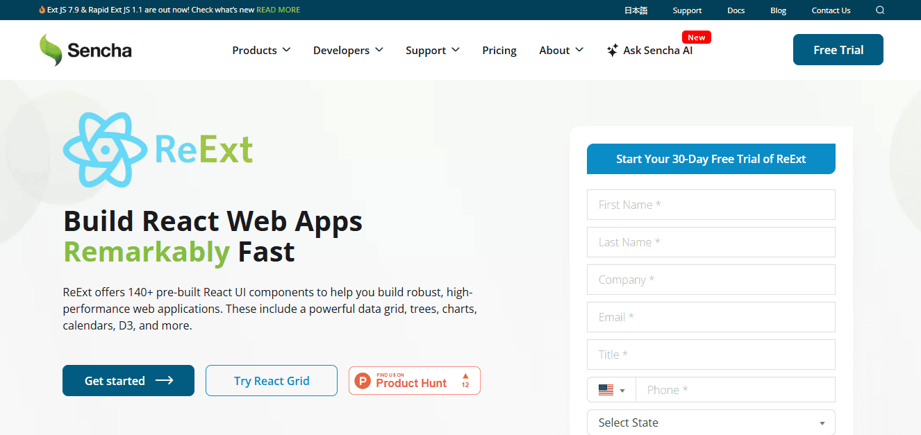
Why ReExt Stands Out
ReExt is where Enterprise-grade reliability meets modern React flexibility.
Let’s say you’re building something serious—like a logistics platform, an enterprise dashboard, or a heavy-duty reporting tool. That’s not the time to stitch together a bunch of lightweight UI kits. That’s where ReExt comes in.
It blends the power of Ext JS, which is known for its deep, enterprise-level UI components, with the flexibility of React. So, instead of choosing between power and modern design, you get both.
You’ve got ready-to-roll React UI Components like complex grids, charting tools, tab views, and detailed layouts. And here’s the thing, they actually work out of the box. No fiddling around with styles or breakpoints. That’s gold in a fast-moving application development cycle.
For example, one fintech startup used ReExt to launch their admin panel. They needed heavy table filtering, real-time data updates, and quick theme changes. ReExt handled it with ease—using React-grid-layout, React Data Grid, and built-in theming features. It saved them weeks.
ReExt helps build inclusive applications with easy customisation, support for WAI-ARIA guidelines, and responsive design already baked in, that don’t feel patched together. Plus, you’re not stuck in a corner. ReExt still gives you full React control—React hooks, state management, everything. It fits into your project like any modern web application framework, but with far fewer compromises.
Need something reliable for different use cases and real business needs? ReExt delivers—no fluff, no mess.
Future Trends and Innovations
Where React UI is heading—and why it matters to devs.
You know how fast frontend tools evolve. What worked great last year might feel clunky today. And honestly, that’s what keeps things exciting.
One shift we’re seeing? Libraries that let devs import only what they need, instead of bloated bundles. It’s about giving back control. Nobody wants to fight with defaults that don’t fit their project.
The best libraries are leaning into customization—not just themes, but logic too. You can tweak how components behave, not just how they look. More customizable layouts, smarter UI, and components that just fit your workflow.
Another cool trend: lighter, faster tools. Some teams now create entire dashboards using low-code + React UI blocks. It’s wild how far that’s come.
Oh, and accessibility isn’t an afterthought anymore. New libraries ship with better keyboard support and ARIA roles out of the box. Finally.
Bottom line? The future looks flexible. The goal isn’t to replace devs—it’s to help them build smarter and skip the boilerplate. If your library lets you move fast and make it your own, you’re winning.
Conclusion
Building good React applications is hard enough without wasting time on buttons, forms, and layout logic from scratch. That’s why pre-built React UI components exist to help developers move faster while keeping quality high.
These libraries solve real-world problems from faster releases to consistent design systems. You get access to well-crafted elements with smooth animations, built-in accessibility, and powerful customisation options. Better yet, your team spends more time solving problems, not styling checkboxes.
Tools like ReExt bring the best of both worlds—enterprise-ready key features with the flexibility of React. If you need advanced data visualization or fast-rendering tables and form flows then ReExt delivers, right out of the box.
For growing teams, improving the developer experience should be a top priority. That means fewer bugs, easier scaling, and UI components you don’t have to babysit. So if your gaol is to build fast, scale smart, and keep your UI maintainable long-term, give ReExt a serious look.
It’s not just another UI library—it’s a time-saver that respects your stack and your schedule.
FAQs
How We Can Reduce Development Time With Pre-built React UI Component Library?
We can reduce the development time by using off-the-shelf UI components. t saves a lot of time on styling, testing, and layout. Just import, customise the components and you are good to go. And let you focus on real features instead of boilerplate.
What Are Some Popular Libraries for Pre-built React UI Components?
Truly, it depends on what you’re building. Like if you’re after a sleek, enterprise-level look, Ant Design is a solid choice. Chakra UI and Radix UI are both great for flexibility and scalability. If you like Tailwind, check out ShadCN UI,it gives you the utility-first feel but with actual components ready to go. And then there’s ReExt, which is super handy for complex data-heavy apps.
Can I Use Pre-built React UI Components for Enterprise Applications?
Absolutely you can use pre-built components and in fact, you should. Most modern React UI libraries are built with scalability in mind. Libraries like ReExt and Ant Design are designed for enterprise needs—think dashboards, internal tools, and custom portals. They handle responsive design, accessibility, and even theming, which saves a ton of dev time down the road.
Try ReExt for Free.