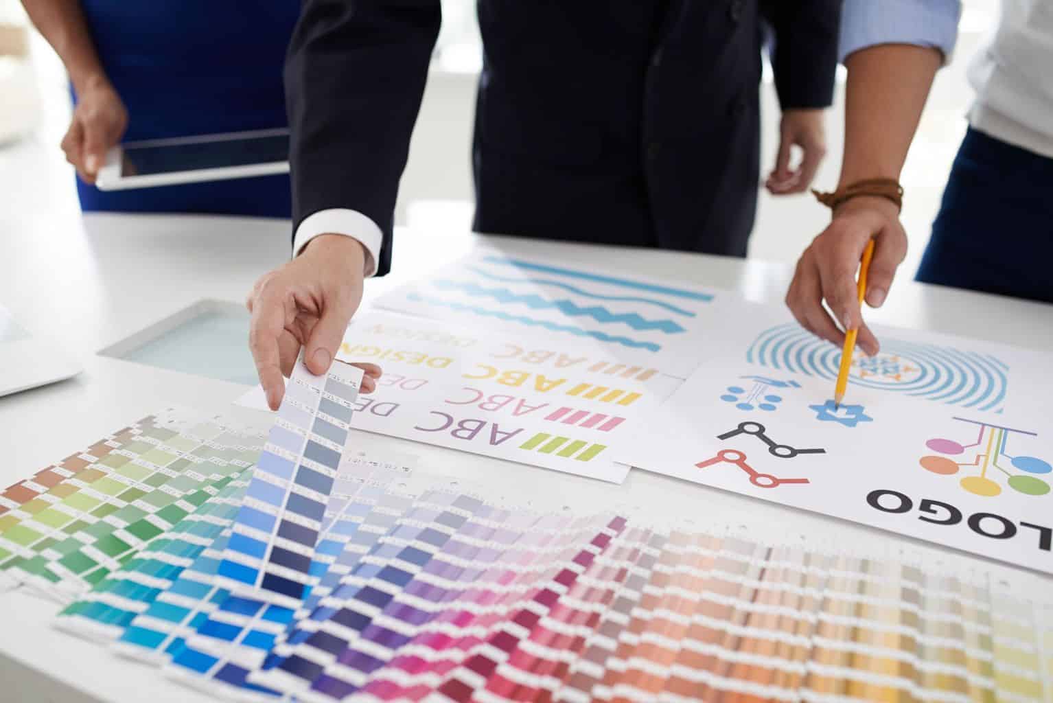
The 5 Secrets to Designing Advertisements That Actually Work

Every advertising campaign is different and you want each design you put up to be your best. You have a desire to make your advertisement to be the one people remember.
People often overthink their marketing techniques and this can lead to poor results.
Reaching people with your ideas is the goal, so why not use some marketing tips to get ahead?
After all, designing advertisements can be fun if you use these five secrets.
1. Define Your Audience
Find the right demographic for your service or product.
Imagine this: You create an advertisement for couple’s therapy and put it up everywhere, including a funeral home. This placement is clearly an insensitive idea and could have been thought out more.
Rather than use the all-or-nothing approach when trying to get the word out about your services, try to narrow your efforts to a certain niche. Using the couple’s therapy advertisement again, you would put this up in a grocery store or a doctor’s office instead.
Defining your target audience will allow you to reach the people who would engage in what your advertisement has to offer.
2. Keep It Simple
Make sure when designing advertisements that you keep the design minimal while making the text or image engaging. This can be done by letting the image speak on its own by using pop-culture references, giving the image a double meaning, or letting the text bring meaning.
Pairing a strong image with a quick and memorable quip is the best bet to a strong design. It is important to not overwhelm the viewer with information or a crazy image, keeping a nice balance will draw them in and it will be easy to remember.
Try to keep the information on the advertisement down to the specific details that the viewer needs, or give them a direct link to what they need (like a QR code). Look at flyer design inspirations to get ideas on how to start your next design.
3. Engage the Viewer
Knowing your target audience will make this part easier.
Use your design to draw that person in. This can be done with the design or loud color, but influencing your viewer to stop and look at what you have to offer is the key.
4. Color
Using color always adds a special touch to advertising design, however, you don’t always need it. Black and white designs can speak loudly in the absence of color. This is an important technique to remember: use a color theme that speaks to what your brand brings to the table.
This means keeping the color story engaging and if possible, making an emotional connection to the viewer.
5. Make a Statement
Use your design to really make waves with the message. Think outside the box, and allow your viewer to feel like a hero. Engage your audience by making them think a little harder or make them interested enough to scan your QR code.
Get creative with the process and play around with the tools you have available.
Designing Advertisements the Right Way
Designing advertisements the right way doesn’t exist.
Every idea in the marketing world is different and is going to have an approach from a different angle and those who don’t invent ideas, copy.
With these advertising tips, you will be successfully creating meaningful designs for the rest of your life.
Find this article helpful?
Check out our blog for more.


